Components · Inline Primitives
Link
StableSince v0.0.1
Styled anchor link with variant and external support.
import { Link } from '@nexub/react';Examples
Default
Variants
External
Props
| Prop | Type | Default | Description |
|---|---|---|---|
| variant | 'default' | 'muted' | 'underline' | — | Visual style of the link. |
| external | boolean | — | Opens the link in a new tab with appropriate rel attributes. |
| href | string | — | The URL the link points to. |
| asChild | boolean | — | Merges props onto the immediate child element (Radix Slot). |
On iOS & Android: Link
@nexub/react-nativeAlpha
import { Link } from '@nexub/react-native';

<Link onPress={() => router.push('/terms')}>Terms of service</Link>
Web vs mobile
Same tokens and prop names. Where the platforms differ:
| Web | iOS & Android | |
|---|---|---|
| Navigation | An anchor; works with your router via asChild. | A pressable text with onPress; navigate with your router. |
| Hit area | Visual size; xs/sm controls meet WCAG 2.5.8 (24px). | Always 44pt, extended with hitSlop when the visual is smaller. |
Interactive preview of @nexub/react-native rendered for the web. Native chrome (switches, pickers, Liquid Glass) looks like the platform on a device.
On device

iPhone (iOS simulator)
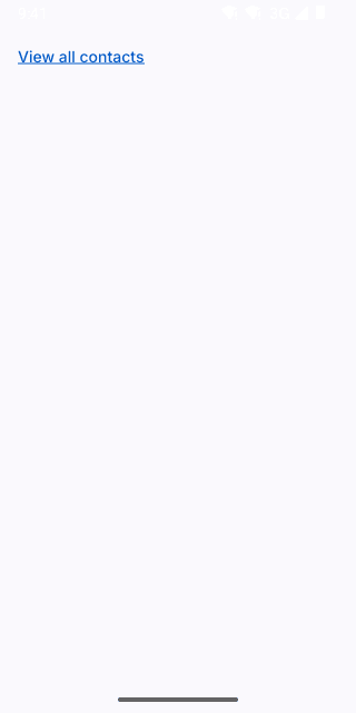
Pixel (Android emulator)
Screenshots from the latest CI run of the showcase app; the live frame renders the same code for the web.
Link props
| Prop | Type | Default | Description |
|---|---|---|---|
| childrenrequired | string | — | — |