Components · Loading States
Progress
StableSince v0.0.1
Horizontal progress bar with optional tone and animation.
import { Progress } from '@nexub/react';Examples
Default
Tones
Animated
Props
| Prop | Type | Default | Description |
|---|---|---|---|
| value | number | — | Current progress value between 0 and max. |
| max | number | 100 | Maximum value of the progress bar. |
| tone | 'neutral' | 'info' | 'success' | 'warning' | 'danger' | — | Semantic colour tone of the filled track. |
| animated | boolean | false | Adds a stripes-in-motion animation to the filled track. |
On iOS & Android: Progress
@nexub/react-nativeAlpha
import { Progress } from '@nexub/react-native';

<Progress value={0.6} label="Uploading" />
Web vs mobile
Same tokens and prop names. Where the platforms differ:
| Web | iOS & Android | |
|---|---|---|
| Label | Optional. | label is required (screen readers). |
Interactive preview of @nexub/react-native rendered for the web. Native chrome (switches, pickers, Liquid Glass) looks like the platform on a device.
On device
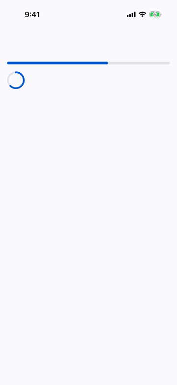
iPhone (iOS simulator)
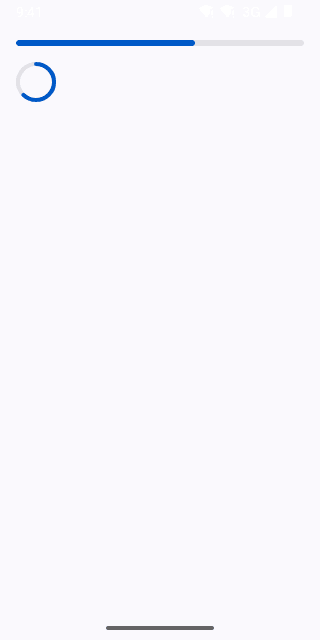
Pixel (Android emulator)
Screenshots from the latest CI run of the showcase app; the live frame renders the same code for the web.
Progress props
| Prop | Type | Default | Description |
|---|---|---|---|
| valuerequired | number | — | 0–1. |
| labelrequired | string | — | — |
| variant | 'linear' | 'circular' | 'linear' | — |
| size | number | — | Circular diameter. |
| style | StyleProp<ViewStyle> | — | — |