Patterns · Pages
Settings
SettingsPageSettingsScreen
Grouped settings with a profile header, controls at the end of each row, and a destructive sign-out.
Web
Live, at a real viewport width. Switch to Phone to see the responsive layout.
Usage
import { SettingsPage } from '@nexub/patterns';

<SettingsPage header={<ProfileCard />} groups={[{ header: 'Security', items: [{ title: 'Face ID', control: <Switch aria-label="Face ID" /> }] }]} />
On iOS & Android: SettingsScreen
@nexub/react-native/patternsAlpha
import { SettingsScreen } from '@nexub/react-native/patterns';

<SettingsScreen groups={[{ header: 'Security', items: [{ title: 'Face ID', variant: 'switch', checked, onCheckedChange }] }]} />
Web vs mobile
Same tokens and prop names. Where the platforms differ:
| Web | iOS & Android | |
|---|---|---|
| Rows | control puts any control at the end of a static row. | ListItem variants (switch, navigation, value), one target per row. |
Interactive preview of @nexub/react-native rendered for the web. Native chrome (switches, pickers, Liquid Glass) looks like the platform on a device.
On device
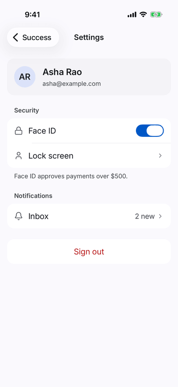
iPhone (iOS simulator)
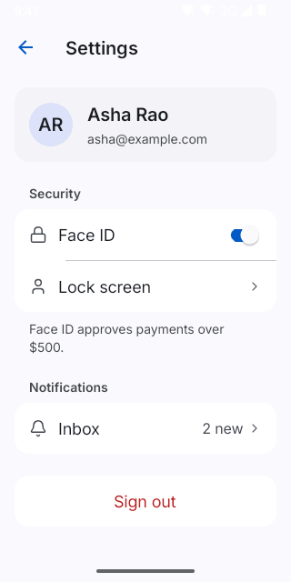
Pixel (Android emulator)
Screenshots from the latest CI run of the showcase app; the live frame renders the same code for the web.
SettingsScreen props
| Prop | Type | Default | Description |
|---|---|---|---|
| header | React.ReactNode | — | Optional profile row/card above the groups. |
| groupsrequired | SettingsGroup[] | — | — |