Components · Actions
Button Group
StableSince v0.0.1
Groups related buttons together with optional attachment and orientation.
import { ButtonGroup } from '@nexub/react';Examples
Default
Attached
Vertical
Props
| Prop | Type | Default | Description |
|---|---|---|---|
| orientation | 'horizontal' | 'vertical' | 'horizontal' | Lays out child buttons horizontally or vertically. |
| attached | boolean | false | Removes gap and merges borders between adjacent buttons. |
On iOS & Android: ButtonGroup
@nexub/react-nativeAlpha
import { ButtonGroup } from '@nexub/react-native';

<ButtonGroup direction="stack">
  <Button size="lg">Continue</Button>
  <Button variant="text">Not now</Button>
</ButtonGroup>
Web vs mobile
Same tokens and prop names. Where the platforms differ:
| Web | iOS & Android | |
|---|---|---|
| Layout | Connected segments in a row. | direction="row" or "stack": full-width buttons stacked, primary on top, as Apple and Material lay out sheet actions. |
Interactive preview of @nexub/react-native rendered for the web. Native chrome (switches, pickers, Liquid Glass) looks like the platform on a device.
On device
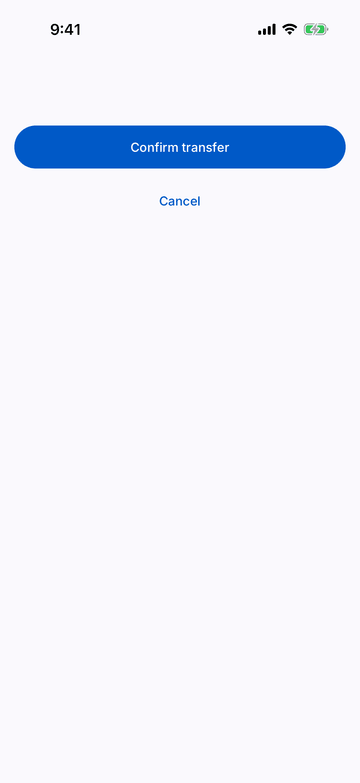
iPhone (iOS simulator)
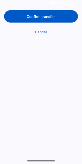
Pixel (Android emulator)
Screenshots from the latest CI run of the showcase app; the live frame renders the same code for the web.
ButtonGroup props
| Prop | Type | Default | Description |
|---|---|---|---|
| childrenrequired | React.ReactNode | — | — |
| direction | 'row' | 'stack' | 'row' | 'stack' puts actions full-width in a column (bottom of forms). |
| style | StyleProp<ViewStyle> | — | — |