Components · Feedback
Toast
Imperative toast notifications using the toast object. Render <Toaster /> once in your layout.
import { Toast } from '@nexub/react';Usage
Confirming a non-blocking action (file saved, message sent)
Reporting a background event the user should know about
Providing brief feedback that disappears automatically
Offering an undo action immediately after a destructive operation
Critical errors that block the user — use Alert or AlertDialog
Information the user must read and acknowledge — use Dialog
Persistent status that should remain visible — use Banner or Alert
Long messages with multiple lines of text
Examples
Default
Variants
With action
Undoable delete
Hide the item right away; delete it for real only when the toast closes without Undo.
Props
| Prop | Type | Default | Description |
|---|---|---|---|
| Toaster expand | boolean | false | Always show toasts as a list. By default they collapse into a stack that fans out on hover or focus, which also pauses their timers. |
| Toaster visibleToasts | number | 3 | How many toasts show at once. Older ones are hidden visually but stay in the live region. |
| toast.success(title, opts?)required | string | — | Show a success toast with an optional options object. |
| toast.error(title, opts?)required | string | — | Show an error toast. |
| toast.warning(title, opts?)required | string | — | Show a warning toast. |
| toast.info(title, opts?)required | string | — | Show an info toast. |
| toast.custom(title, opts?)required | string | — | Show a default/custom toast. |
| toast.undoable(title, opts)required | UndoableToastOptions | — | A toast with an Undo action (beta, 1.7.0). Undo calls opts.onUndo; any other close (timer, swipe, close button, toast.dismiss) calls opts.onCommit, exactly once. Returns the toast id. |
| undoable opts | { onUndo; onCommit?; undoLabel?; description?; duration? } | — | undoLabel defaults to the undo message ("Undo"). Commit the change in onCommit, not before showing the toast. |
| opts.description | string | — | Secondary supporting text below the title. |
| opts.duration | number | 5000 | Time in ms before auto-dismiss. Use Infinity to persist. |
| opts.action | { label: string; onClick: () => void } | — | Renders an action button inside the toast. |
On iOS & Android: ToastProvider + useToast
import { ToastProvider, useToast } from '@nexub/react-native';

const toast = useToast();
toast({ message: 'Payment sent', action: { label: 'Undo', onPress: undo } });
Web vs mobile
Same tokens and prop names. Where the platforms differ:
| Web | iOS & Android | |
|---|---|---|
| Stack | A stack you can expand. | One at a time, above the tab bar; announced to screen readers. |
| Timing | Configurable. | 'short' 4 s; 'long' 10 s, the default when it has an action (WCAG 2.2.1). |
Interactive preview of @nexub/react-native rendered for the web. Native chrome (switches, pickers, Liquid Glass) looks like the platform on a device.
On device
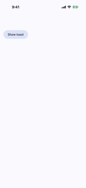
iPhone (iOS simulator)
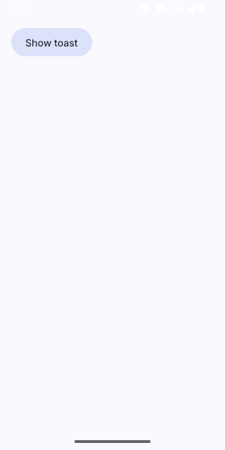
Pixel (Android emulator)
Screenshots from the latest CI run of the showcase app; the live frame renders the same code for the web.
ToastProvider props
| Prop | Type | Default | Description |
|---|---|---|---|
| childrenrequired | React.ReactNode | — | — |
| bottomOffset | number | 0 | Extra space above the bottom inset, e.g. the tab bar height. |