Components · Data Display
Amount
Betav1.5.0 → v1.6.0
Honest money: Intl formatting, tabular numerals, the currency’s minor unit and a true minus sign.
import { Amount } from '@nexub/react';Examples
Display
Gains and losses
Props
| Prop | Type | Default | Description |
|---|---|---|---|
| valuerequired | number | — | The amount. |
| currencyrequired | string | — | ISO 4217 code, e.g. "USD". |
| locale | string | — | BCP 47 locale. Defaults to the user's. |
| size | 'sm' | 'md' | 'lg' | 'display' | 'md' | display is a hero figure with a quieter symbol and minor units. |
| tone | 'neutral' | 'auto' | 'neutral' | auto colours gains success and losses error. |
| signDisplay | Intl signDisplay | — | e.g. 'exceptZero' to show + on gains. |
| animate | boolean | false | Roll the digits to new values (NumberTicker). The first render never animates. |
On iOS & Android: Amount
@nexub/react-nativeAlpha
import { Amount } from '@nexub/react-native';

<Amount value={-42.5} currency="SGD" tone="auto" size="display" />
Web vs mobile
Same tokens and prop names. Where the platforms differ:
| Web | iOS & Android | |
|---|---|---|
| Sizes | Inline, sized by context. | size sm–lg plus display for the hero balance. |
| Formatting | Intl.NumberFormat. | Same output on Hermes, which lacks formatToParts (handled by @nexub/core). |
Interactive preview of @nexub/react-native rendered for the web. Native chrome (switches, pickers, Liquid Glass) looks like the platform on a device.
On device
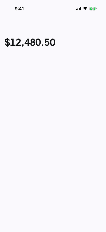
iPhone (iOS simulator)
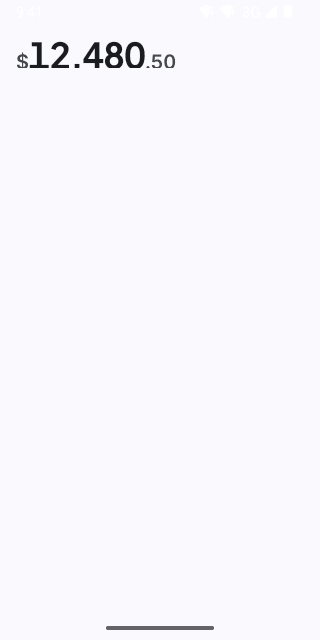
Pixel (Android emulator)
Screenshots from the latest CI run of the showcase app; the live frame renders the same code for the web.
Amount props
| Prop | Type | Default | Description |
|---|---|---|---|
| animate | boolean | false | Animate value changes: the new figure rises in on the spatial spring. Wraps the text in a view, so leave it off when Amount sits inside other text. |
| valuerequired | number | — | — |
| currencyrequired | string | — | ISO 4217 code, e.g. 'USD', 'EUR', 'INR'. |
| locale | string | — | BCP 47 locale. |
| size | 'sm' | 'md' | 'lg' | 'display' | — | display: a hero figure in the brand face with a quieter symbol and minor units. |
| tone | 'neutral' | 'auto' | 'neutral' | auto colours gains success and losses error (use with signDisplay). |
| signDisplay | Intl.NumberFormatOptions['signDisplay'] | — | e.g. 'exceptZero' to show "+" on gains. |
| style | StyleProp<ViewStyle> | — | — |