Components · Form & Input
Money Input
BetaSince v1.5.0
An amount field: locale-aware parsing as you type, grouped on blur, the currency symbol leading.
import { MoneyInput } from '@nexub/react';Examples
Default
German separators
Props
| Prop | Type | Default | Description |
|---|---|---|---|
| currencyrequired | string | — | ISO 4217 code, e.g. "EUR". |
| locale | string | — | BCP 47 locale for separators. Defaults to the user's. |
| value / defaultValue | number | null | — | The amount, or null when empty. |
| onValueChange | (value: number | null) => void | — | Parsed amount, rounded to the minor unit, as the person types. |
On iOS & Android: MoneyInput
@nexub/react-nativeAlpha
import { MoneyInput } from '@nexub/react-native';

<MoneyInput currency="SGD" value={amount} onValueChange={setAmount} />
Web vs mobile
Same tokens and prop names. Where the platforms differ:
| Web | iOS & Android | |
|---|---|---|
| Large entry | MoneyInput only. | Also ExpressiveMoneyInput + NumericKeypad for full-screen amount entry. |
Interactive preview of @nexub/react-native rendered for the web. Native chrome (switches, pickers, Liquid Glass) looks like the platform on a device.
On device

iPhone (iOS simulator)
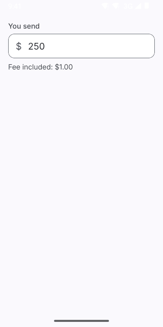
Pixel (Android emulator)
Screenshots from the latest CI run of the showcase app; the live frame renders the same code for the web.
MoneyInput props
| Prop | Type | Default | Description |
|---|---|---|---|
| currencyrequired | string | — | — |
| value | number | null | — | — |
| defaultValue | number | null | — | — |
| onValueChange | (value: number | null) => void | — | Parsed value (rounded to the currency's minor units), or null when empty. |
| locale | string | — | — |