Patterns · People
UserCard
Since v0.0.1
User profile card displaying avatar, name, role, and optional actions.
import { UserCard } from '@nexub/patterns';Examples
Default
Props
| Prop | Type | Default | Description |
|---|---|---|---|
| namerequired | string | — | User display name. |
| string | — | User email address. | |
| role | string | — | Job title or role label. |
| avatar | string | — | URL for avatar image. |
| actions | React.ReactNode | — | Action buttons or menu. |
On iOS & Android: ProfileHeader
@nexub/react-native/patternsAlpha
import { ProfileHeader } from '@nexub/react-native/patterns';

<ProfileHeader name="Sasi" detail="[email protected]" onPress={editProfile} />
Web vs mobile
Same tokens and prop names. Where the platforms differ:
| Web | iOS & Android | |
|---|---|---|
| Use | A card in a grid or list. | The header row at the top of Settings or a profile screen. |
Interactive preview of @nexub/react-native rendered for the web. Native chrome (switches, pickers, Liquid Glass) looks like the platform on a device.
On device
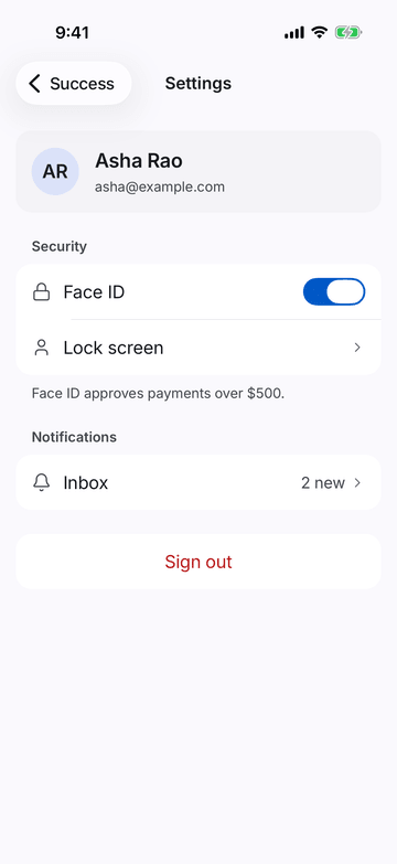
iPhone (iOS simulator)
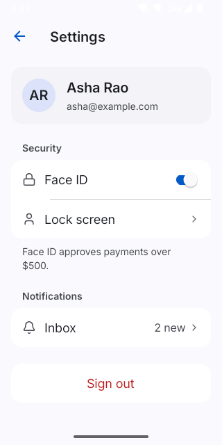
Pixel (Android emulator)
Screenshots from the latest CI run of the showcase app; the live frame renders the same code for the web.
ProfileHeader props
| Prop | Type | Default | Description |
|---|---|---|---|
| namerequired | string | — | — |
| detail | string | — | — |
| image | string | — | — |
| onPress | () => void | — | — |